Successfully Design A Reversible Jersey

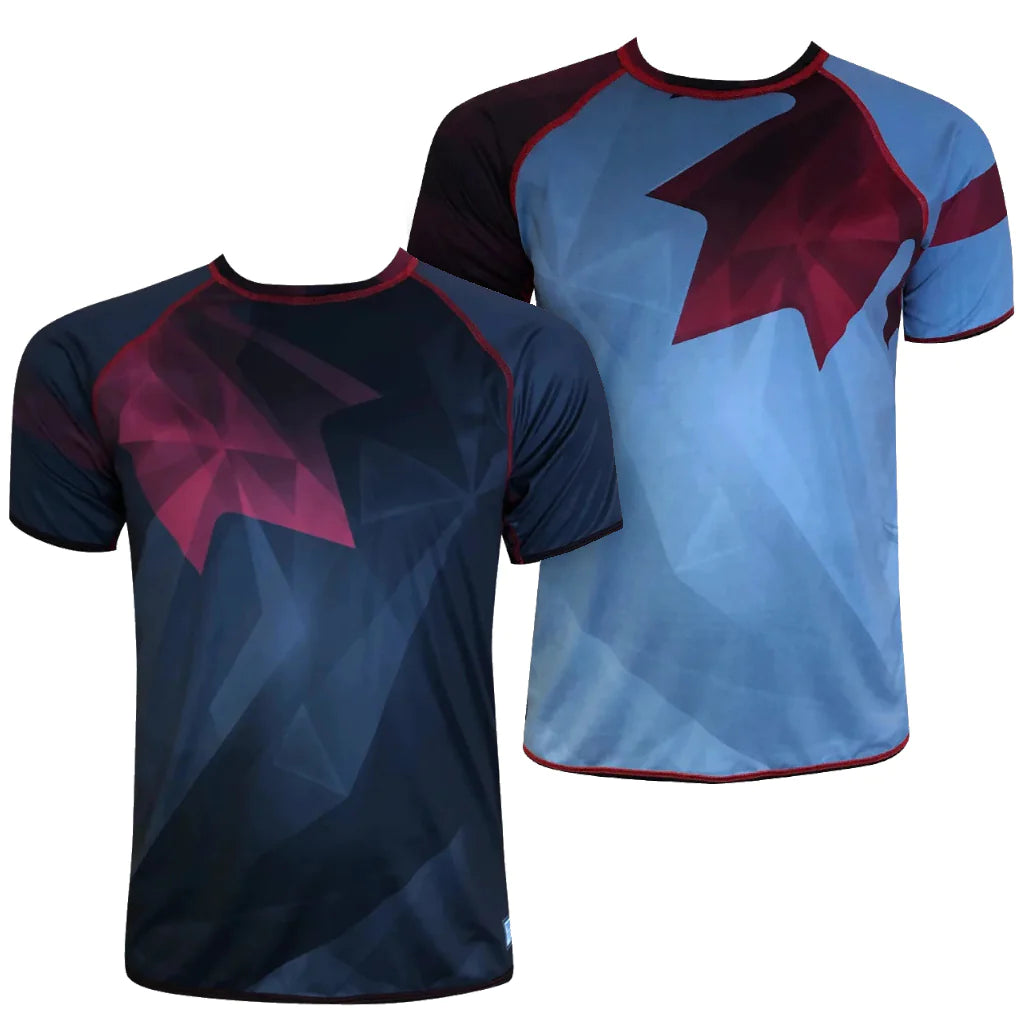
Our Reversible Raglan has received a lot of attention since we introduced it to the world. Many of you have jumped at the opportunity of creating your own design for your school, club, and league teams! While we love the enthusiasm from the community, we want to be sure you equally love your jerseys – and this product requires a few special considerations at the design stage.
Creating art for a great reversible jersey can be tough, so we're here to share a few tips learned along the way. Grab a pen and a notebook, and let's get technical!
REVERSIBLE TANK & REVERSIBLE JERSEY DESIGN TIPS
A DARK/DARK OR A DARK/BRIGHT
All sublimated fabric is originally white on both sides – flip any of your sublimated jerseys inside out to see what we mean. See how the reverse side of your jersey is mostly white, yet you can still see the design (or parts of the design) showing through slightly? We call this bleedthrough, and that's the most important detail to keep in mind when designing a piece of reversible apparel: art aspects from one side will show through to the other.
We have tested multiple possible solutions to minimize bleedthrough: colour matching, art mirroring, shade matching... and the only way to success is by designing either two dark sides, or a dark side and a bright side. White and/or very light colours are not available due to bleedthrough.
PATTERNS TO THE RESCUE
Background patterns are your best friend! They are great at distracting the eye away from bleedthrough.
COLOUR WHEEL FOR THE WIN
Contrasting colours will cancel each other out, so it's better to keep colours within a similar family. We suggest you use the colour wheel below to help select colours for your numbers, pattern, or logos.
 Tips:
Tips:
- Pick colours from a similar family or from the same side of the colour wheel. This will ensure they complement each other.
- Bleedthrough will change colours! Any colour used on the Bright side will appear darker due to the bleedthrough from the Dark side. See our example below, and remember colour addition theory: blue and red may result in purple; blue and yellow will result in green.
- Beware of strong contrast between light and dark colours – the darker the colours on one side, the darker/more saturated the colours will need to be on the other side.

Unaltered colour backed with WHITE (bottom row) and the same colour backed with BLACK (top row). Pantone colours used noted at bottom.
WHITE AND LIGHT COLOURS WILL NOT WORK
Here is white light colours are not recommended - the bleedthrough is too strong. Note how white and yellow are affected by any other colour pressed on reverse, while bright blues only show subtle variance in tone. Unaltered colour (backed with white) is shown at far right.

POSITION OF DESIGN ELEMENTS
The easiest way to avoid glaring bleedthrough is by mirroring the art between the two sides, as shown here:

We also recommend positioning smaller elements (sponsor or sleeve logos) in such a way that they will be offset/not directly back-to-back. This includes anything that needs to be clear, or has text. For example, a sleeve logo will be placed higher on side A and lower on side B; or a back logo could be positioned on the lower left of both sides.
NAMES AND NUMBERS
The most important part of the jersey in terms of legibilty! Opt for wide, block-type fonts, and avoid thin or very narrow ones. Thick, bold characters will be much easier to read.
Note: Due to the darker overall colours required and unavoidable bleedthrough in numbers, it’s not possible to meet Ultimate Canada, USAU or WFDF’s contrast requirements for competition.

CONTRAST STITCHING
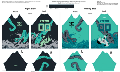
Reversible apparel gets finished with a separate piece of binding at the jersey bottom and sleeve hems. Binding colour is restricted to our stock fabric colours (black, white, red, royal, navy, charcoal), but is a great place to add some contrast colour! The same goes for stitching – on jerseys, the shoulder seams are exposed. And due to the garment construction, only one side of the collar will be visible once sewn.
Is your jersey black with red numbers? Choose red binding, stitching and collar for an extra pop of colour, or opt for black to keep it sleek and subtle. The important part is to choose a colour that works with the design on both sides.
PLAN AHEAD, AND TAKE THE TIME TO GET IT RIGHT
Don't rush the process! If you're unsure whether a particular colour combination will work, please reach out - we're here to help! And don't get discouraged by all the restrictions involved, it's worth it when you end up with a great product.
It's best to start the process early! If you have an idea in mind, email us, fill out our interest form or submit a design review/request form.
SUCCESS!
That's it! If you take these tips into consideration, we guarantee you will love the final product. While the Reversible Raglan jersey may take a bit more time and attention during the design process, the resulting product will look great, will cost you less than a full kit, and even reduces our environmental footprint by utilizing less fabric – it's a win-win-win!
If you'd like to start designing your next Reversible team order, let's talk. If you have any questions about sizing or turnaround time visit the Reversible Raglan product page.


